 OpenHarmony 定义扩展组件样式:@Extend 装饰器
说明: 从 API version 9 开始,该装饰器支持在 ArkTS 卡片中使用。
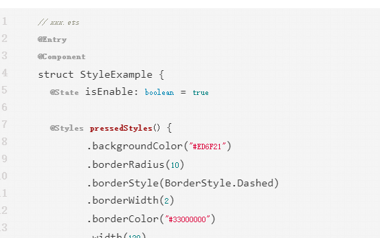
装饰器使用说明
语法
@Extend(UIComponentName) function functionName { ... }
使用规则
● 和 @Styles 不同,@Extend 仅支持定义在全局,不支持在组件内部定义。
● 和 @Styles 不同,@Extend 支持封装指定的组件的私有属性和私有事件,以及预定义相同组件的 @Extend 的方法。
// @Extend(Text)可以支持Text的私有属性fontColor
@Extend(Text) function fancy () {
  .fontColor(Color.Red)
}
// superFancyText可以调用预定义的fancy
@Extend(Text) function superFancyText(size:number) {
    .fontSize(size)
    .fancy()
}
● 和 @Styles 不同,@Extend 装饰的方法支持参数,开发者可以在调用时传递参数,调用遵循 TS 方法传值调用。
// xxx.ets
@Extend(Text) function fancy (fontSize: number) {
  .fontColor(Color.Red)
  .fontSize(fontSize)
}

@Entry
@Component
struct FancyUse {
  build() {
    Row({ space: 10 }) {
      Text('Fancy')
        .fancy(16)
      Text('Fancy')
        .fancy(24)
    }
  }
}
● @Extend 装饰的方法的参数可以为 function,作为 Event 事件的句柄。
@Extend(Text) function makeMeClick(onClick: () => void) {
  .backgroundColor(Color.Blue)
  .onClick(onClick)
}

@Entry
@Component
struct FancyUse {
  @State label: string = 'Hello World';

  onClickHandler() {
    this.label = 'Hello ArkUI';
  }

  build() {
    Row({ space: 10 }) {
      Text(`${this.label}`)
        .makeMeClick(this.onClickHandler)
    }
  }
}
● @Extend 的参数可以为状态变量,当状态变量改变时,UI 可以正常的被刷新渲染。
@Extend(Text) function fancy (fontSize: number) {
  .fontColor(Color.Red)
  .fontSize(fontSize)
}

@Entry
@Component
struct FancyUse {
  @State fontSizeValue: number = 20
  build() {
    Row({ space: 10 }) {
      Text('Fancy')
        .fancy(this.fontSizeValue)
        .onClick(() => {
          this.fontSizeValue = 30
        })
    }
  }
}
使用场景
以下示例声明了 3 个 Text 组件,每个 Text 组件均设置了 fontStyle、fontWeight 和 backgroundColor 样式。
@Entry
@Component
struct FancyUse {
  @State label: string = 'Hello World'

  build() {
    Row({ space: 10 }) {
      Text(`${this.label}`)
        .fontStyle(FontStyle.Italic)
        .fontWeight(100)
        .backgroundColor(Color.Blue)
      Text(`${this.label}`)
        .fontStyle(FontStyle.Italic)
        .fontWeight(200)
        .backgroundColor(Color.Pink)
      Text(`${this.label}`)
        .fontStyle(FontStyle.Italic)
        .fontWeight(300)
        .backgroundColor(Color.Orange)
    }.margin('20%')
  }
}
@Extend 将样式组合复用,示例如下。
@Extend(Text) function fancyText(weightValue: number, color: Color) {
  .fontStyle(FontStyle.Italic)
  .fontWeight(weightValue)
  .backgroundColor(color)
}
通过 @Extend 组合样式后,使得代码更加简洁,增强可读性。
@Entry
@Component
struct FancyUse {
  @State label: string = 'Hello World'

  build() {
    Row({ space: 10 }) {
      Text(`${this.label}`)
        .fancyText(100, Color.Blue)
      Text(`${this.label}`)
        .fancyText(200, Color.Pink)
      Text(`${this.label}`)
        .fancyText(300, Color.Orange)
    }.margin('20%')
  }
}
审核编辑 黄宇
声明:本文内容及配图由入驻作者撰写或者入驻合作网站授权转载。文章观点仅代表作者本人,不代表电子发烧友网立场。文章及其配图仅供工程师学习之用,如有内容侵权或者其他违规问题,请联系本站处理。
举报投诉
-
API
+关注
关注
2文章
1500浏览量
62008 -
鸿蒙
+关注
关注
57文章
2351浏览量
42847 -
OpenHarmony
+关注
关注
25文章
3722浏览量
16311
发布评论请先 登录
相关推荐
基于ArkTS语言的OpenHarmony APP应用开发:图片显示器
1、程序简介
该程序是基于OpenHarmony标准系统编写的UI应用类:简易图片显示器。
该程序设计5个按钮和图片框。当每次按下不同的按钮,则图片框显示框显示图片样式各不相同。
本案例已在
发表于 09-14 14:22
基于ArkTS语言的OpenHarmony APP应用开发:简易计数器
)Button自定义样式
包含 Text 组件:样例给 Button 添加了一个 Text 子组件,通过设置 Text 的文本样式达到修改
发表于 09-14 13:38
基于ArkTS语言的OpenHarmony APP应用开发:HelloOpenharmony
可以使用反引号(`)来定义多行文本和内嵌表达式。
var data: string;
data = \"Hello, OpenHarmony\";
data = \'Hello
发表于 09-14 12:47
龙芯2K0300蜂鸟板支持OpenHarmony 4.0 Release版本操作系统
龙芯2K0300蜂鸟板是基于龙芯中科自研的LoongArch架构2K0300处理器设计的,整体结构小巧紧凑,功能丰富齐全。龙芯2K0300蜂鸟板采用核心板加扩展底板的模块化设计方式,有助于合作厂商
发表于 06-20 10:02
鸿蒙ArkTS声明式开发:跨平台支持列表【多态样式】 通用属性
设置组件不同状态的样式。 从API version 9开始,该接口支持在ArkTS卡片中使用。
【AWTK使用经验】如何自定义combo_box下拉框样式
需要在ZTP800示教器实现一个用于日期选择的下拉框,并且还要求对下拉框做一些美化,此时就需要用户自定义下拉框样式。下面将结合该需求介绍两种修改combo_box

HarmonyOS实战开发-深度探索与打造个性化自定义组件
和可维护性,提高代码效率。
自定义组件:是由@Component装饰的UI单元,可以组合多个系统组件实现UI的复用,可以调用组件的生命周期。
发表于 05-08 16:30
OpenHarmony实战开发-如何实现组件动画。
ArkUI为组件提供了通用的属性动画和转场动画能力的同时,还为一些组件提供了默认的动画效果。例如,List的滑动动效,Button的点击动效,是组件自带的默认动画效果。在组件默认动画效

鸿蒙ArkUI实例:【自定义组件】
组件是 OpenHarmony 页面最小显示单元,一个页面可由多个组件组合而成,也可只由一个组件组合而成,这些组件可以是ArkUI开发框架自
OpenHarmony父子组件单项同步使用:@Prop装饰器
@Prop装饰的变量可以和父组件建立单向的同步关系。@Prop装饰的变量是可变的,但是变化不会同步回其父组件。 说明: 从API version 9开始,该
鸿蒙开发教程-管理组件状态
跨组件层级双向同步状态是指@Provide修饰的状态变量自动对提供者组件的所有后代组件可用,后代组件通过使用@Consume装饰的变量来获得
鸿蒙OpenHarmony NAPI威廉希尔官方网站 -基础学习
NAPI(Native API)是OpenHarmony系统中的一套原生模块扩展开发框架,它基于Node.js N-API规范开发,为开发者提供了JavaScript与C/C++模块之间相互调用的交互能力。可以在NodeJs官网查看各种NAPI接口

鸿蒙开发-ArkUI 组件基础
。
文本样式
针对包含文本元素的组件,例如Text、Span、Button、TextInput等,可使用fontColor、fontSize、fontStyle、 fontWeight
发表于 01-17 19:31


 工商网监
工商网监
评论